


Opisso Studio
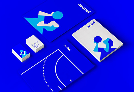
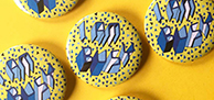
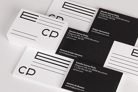
Opisso Studio crafts impressive identity and branding work for brands and institutions throughout Spain. Often using geometric forms and bright colors, they create memorable logos, custom typefaces, and striking illustrations. I especially love their logo for Asobal, a Spanish handball association. Using simple flat shapes, they crafted a charming handball player who looks focused and ready for battle.
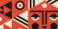
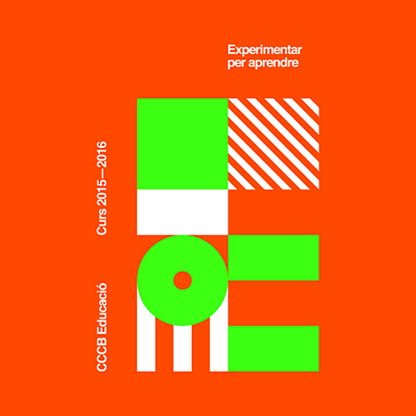
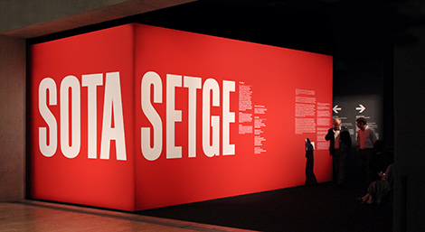
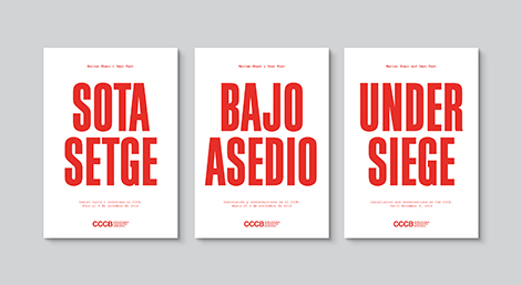
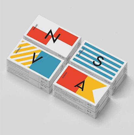
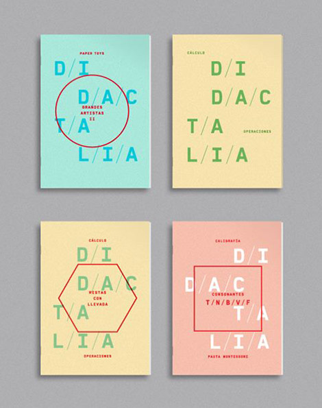
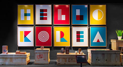
In addition to their identity work, they often create graphics for some of Spain’s most respected museums. While working with The Centre de Cultura Contemporània de Barcelona, the studio employed a range of typographic styles to convey the spirit of each program. For the museum’s ongoing education series, which encourages experimentation and provides activities for families, Opisso created a robust typeface with playful sensibilities. The letterforms’ modularity expresses the program’s structured curriculum, while the striped patterns and neon colors portray its child-friendly components. In stark contrast, a more somber look was implemented for a retrospective focused on the concept of a “siege” by applying large domineering signage on red and black walls.

——————–
Also worth viewing:
La Boca Update
TwoPoints.Net
Janne Iivonen
Follow us on RSS, Instagram, Pinterest, Wanelo,
——————–
